The Quiet Language of the Garden: Tone, Colour and Texture
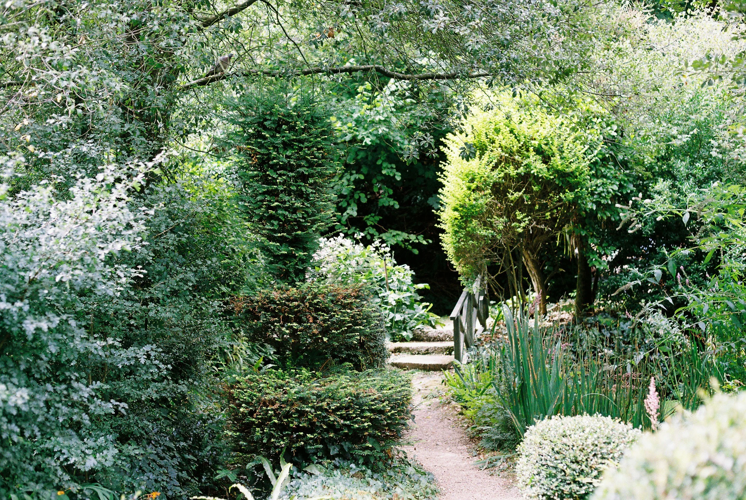
Greens can vary dramatically, from silvery greys to vibrant pops making a garden interesting and beautiful even during the more dormant winter months.
I used to think a good garden was just a list of plants that didn't die. Put in some roses, a hedge, maybe a nice pot by the door, and call it a day. It took me years — and a lot of garden time that felt strangely flat despite being full of healthy, thriving plants — to understand what was actually missing. It wasn't more plants. It was a conversation between them.
That conversation happens through three things: tone, colour, and texture. They sound like design-school words, but really they're just the garden's way of telling you how to feel when you walk through it.
Tone sets the mood before you notice a single flower
Tone is the overall temperature of a space — warm or cool, bright or hushed, wild or restrained. I think of it as the thing you sense in the first three seconds, before your eye has landed on anything specific. A garden of silvery lavender, pale stone and soft grasses has a completely different tone than one packed with dahlias in hot pink and orange.
Neither is "better." The mistake I made early on was borrowing tones from gardens I admired without asking whether they fit the house, the light, or honestly, my own temperament. A hot, saturated garden in full sun near a stark modern city house, in an appropriate suburb, can look sensational. The same planting tucked against a shady, weathered brick cottage can feel like it's fighting the building. Tone isn't chosen in isolation — it's chosen in relationship to everything around it.
Colour is where most of us start, and where most of us get stuck
Colour is the part everyone thinks about first, and also the part that trips people up, because it's tempting to treat it like decorating a room — pick a palette, buy the plants, done. Gardens don't sit still for you like that. They shift week to week, season to season, and a colour scheme that sings in May can go quiet or clash by August.
What's helped me more than any colour wheel is limiting myself and knowing what each plant in each season will bring. A palette of two or three colour families, repeated with variation, reads as intentional in a way that "one of everything" never does. I lean on foliage a lot here too — greens aren't neutral, they're colours in their own right, and silvery, blue-green, or deep bronze foliage can do as much work as any flower to hold a palette together between bloom cycles.
The other thing I've learned: colour needs quiet moments to matter. A garden that's vivid everywhere has nowhere for the eye to rest, and paradoxically ends up feeling less colourful than one with breathing room — patches of green, gravel, or simple foliage that let the bright moments actually register as bright.
## Texture is the part that makes a garden feel alive
Texture is the one people underestimate, and it might be my favourite of the three. It's the difference between a border that photographs nicely and one that actually feels good to walk past — the contrast between the fine, feathery movement of grasses and the bold, still shape of a hosta leaf; the roughness of bark against the smoothness of river stone; something soft enough to brush your hand against as you pass.
Texture is also what carries a garden through the months when colour isn't doing much. A winter border built entirely on flower colour is a sad, bare thing. One built with attention to texture — seed heads left standing, structural evergreens, ornamental grasses catching frost — still has plenty to say.
My rule of thumb is to make sure every planting has at least one "big and bold," one "fine and airy," and one "solid and structural" element near each other. It's a small thing, but it's usually the difference between a bed that looks like a collection of plants and one that looks like it was actually designed.
Letting the three talk to each other
None of this works in isolation, and that's really the heart of it. A hot colour palette needs a tone that can hold it without feeling frantic. A restrained, cool-toned garden leans hard on texture to keep from feeling flat. The best gardens I've spent time in — and the best moments in my own, on the rare occasions I get it right — are the ones where you can't quite say whether it's the colour or the shape or the way the light catches a grass head that's making you want to linger. It's all three, working together, quietly.
If you're starting from scratch, my honest advice is to resist the urge to solve all three at once. Pick your tone first — it's the emotional foundation everything else sits on. Let colour follow from that. And save texture for last, using it to stitch the whole thing together and keep it interesting long after the flowers have had their moment.
Gardens are patient teachers and if you need any extra guidance or support then that’s what we’re here for, don’t be afraid to reach out and we can work together to reach a magnificient vision for your garden.